Colors are hard
— #project, #website — 1 minute to read
Even though I have absolutely no feeling for colors, I’ve been playing with a few color palette tools. While this can be fun, none really helped to decide on what to use on a website.
The main issue is, that you usually only see blocks of colors mixed in some sort of color theory, but not how it would look on an actual webpage.
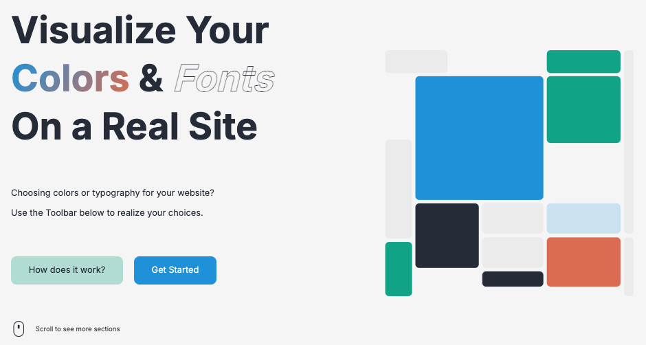
I guess that’s why I really liked Realtime Colors.

You can choose between different templates like a general website, a blogpost or even a dashboard and see how your color choices result in a different look and feel. Plus - once you are done, you can export your color choices in multiple formats.
I still can’t decide if I like my current theme with blue, green and red. So things will probably change again in the future, but I will keep this for now.
Perhaps there’s even a dark mode in the future…
